Project
To design a website for a management consultancy firm called XYZ who approached Deloitte to have their firm's portfolio presented in the form of a website showcasing its services and functionalities offered.
Target audience
This firm is specifically targeting Chief position holders of various startups.
Service offered
Freedom of assumption has been taken here along with the data given and has been deduced that this consultancy firm offers services such as Tax audits, Executive search consultation, detailed growth reports, account handling, merger management, handovers, etc.
Website breakdown
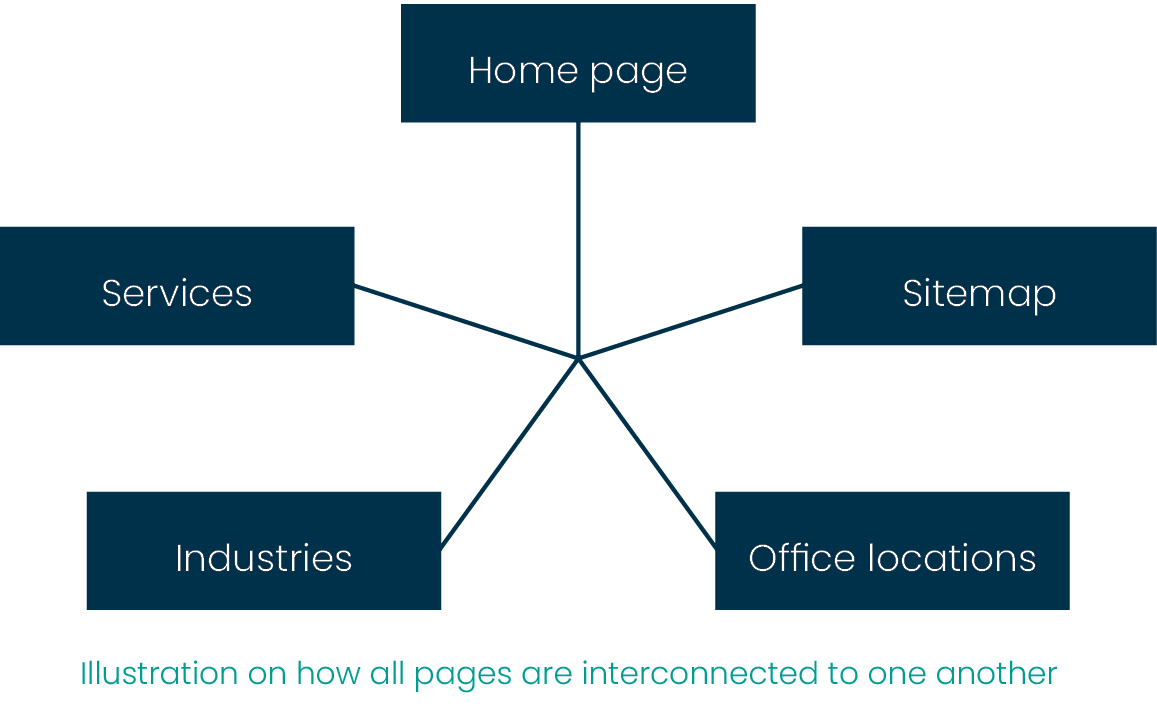
The website is divided into 5 pages for now, with the possibility of more pages if needed when necessary. The 5 main pages, for now, would be the Home page(landing page), Services, Industries, Office locations & Sitemap.

The index file of the website when accessed would take the user to the Home page after which the user is free to navigate within and beyond that page using the Sidenav bar and navbar on the top.
Wireframing
Wireframing has been done roughly on Figma and not on any tool specifically built for wireframing and can be seen as various frames upon which the design is made. Also to be noted that the design at the later stage may have gone through certain but not major changes based on the content and ad-hoc requirements, but the resemblance to the wireframe has been considered as an utmost priority since wireframes would be the rough layout which was approved by the client at the initial stage.
Tools Used

Color palette
The basic color principle of 60-30-10 rule has been used here to maintain simplicity and to keep the color memory to a minimum as the client is a professional organization in the finance industry and the targeted audience as well, are chief position holders from various reputed startups.
Primary color: Deep blue (#00324b)
Blue and darker shades of blue usually portray trustworthiness and loyalty running in parallel with professionalism, transparency, and dependability. The majority of the text on the site uses this primary color.
Some popular examples of firms using blue and variants of blue are namely Dell, American Express, General Electric, Ford, IBM, etc.
Secondary color: Shade of Grey (#EBEBEB)
This shade of Grey tends towards white. And since it leans towards white within the color spectrum, provides a neutral backdrop and hence facilitates other colors to shine. It keeps the subconscious calm and open to thoughts. Grey has been used for H1, Footer text, and trivia texts within sections.
Accent color: Turquoise (#049D94)
Turquoise and shades of Turquoise portray serenity and balance. Like blue, it can be taken for clarity of mind and creativity. Hence this color has been used for CTA buttons and for design highlights to refresh the sight.

These colors make the text legible and the graphics pop out(Fitts’s law) which are crucial for web accessibility. They are Color Blind Safe as they do not conflict with each other. Since the background is a shade of Grey, the contrast between the background and the 2 colors used, pass with a high contrast ratio which is crucial for ease of view.
Variations of Grey could be seen if deemed necessary at certain points throughout the design.
Typeface
Poppins: Two weights of this sans serif font namely Light and Bold, have been used throughout the website. Since this is a google font, it is free and can be referenced at https://fonts.google.com/specimen/Poppins. This avoids the need for the visitor to have the font pre-installed, hence avoiding font rollback. Also, Poppins gives a clean and elegant look to the website. Being used by many websites and one of the top 10 most used typefaces across the internet, it gives a feeling of familiarity(Jakob’s law).
H1: 80 px; H2: 56 px; H3: 32 px; Body Text: 20 px; CTA's and nav button: 16px.
Design
The design has been made using Figma. With base design being made for the most widely used monitor resolution 1920x1080 (Full HD) with 16:9 as the viewport layout for content visibility at any given frame of the website. A padding of 120 px has been implemented in each section.
Home page: The homepage starts with a hero section housing the H1 and a CTA for the user to directly get in touch with the firm. The homepage is divided into various sections and each of those sections would have its own container housing the main div block from where the nesting starts. A few sections that can be seen are About Us, How to Reach Us, etc.
Services: The Services page, as the name indicates, provides insights on the various types of services offered by the firm like Taxation, Audits, Consultation, etc. Each of these sections is spaced accordingly, with additional info in the form of info-graphics, client success stories, performance charts, etc.
Industries: This page represents the various fields the company portfolio stretches to. Hence giving a wide range of insights into how diverse the firm is when it comes to expertise. And each of these fields is associated with a quantitative measure of the success and outcome in that respective field which acts as a cornerstone for gauging the firm’s capability.
Office locations: Even though this is a pretty new firm, the office locations can be seen across the globe within the prominent time regions depicting the reach and growth of the firm with regional accessibility.
Sitemap: This page offers indexed links categorized into various fields so that the user can pinpoint what they are looking for and navigate within the page without hassle.
General: The web pages have a general Navbar, Footer and a SideNav bar as a common appearance in all pages as that would help the user know where they are on the web page and where they would want to go.
